Case studies
Building Community Notes
Building Nubank
Petal quick wins
Personal
About me
My notebook
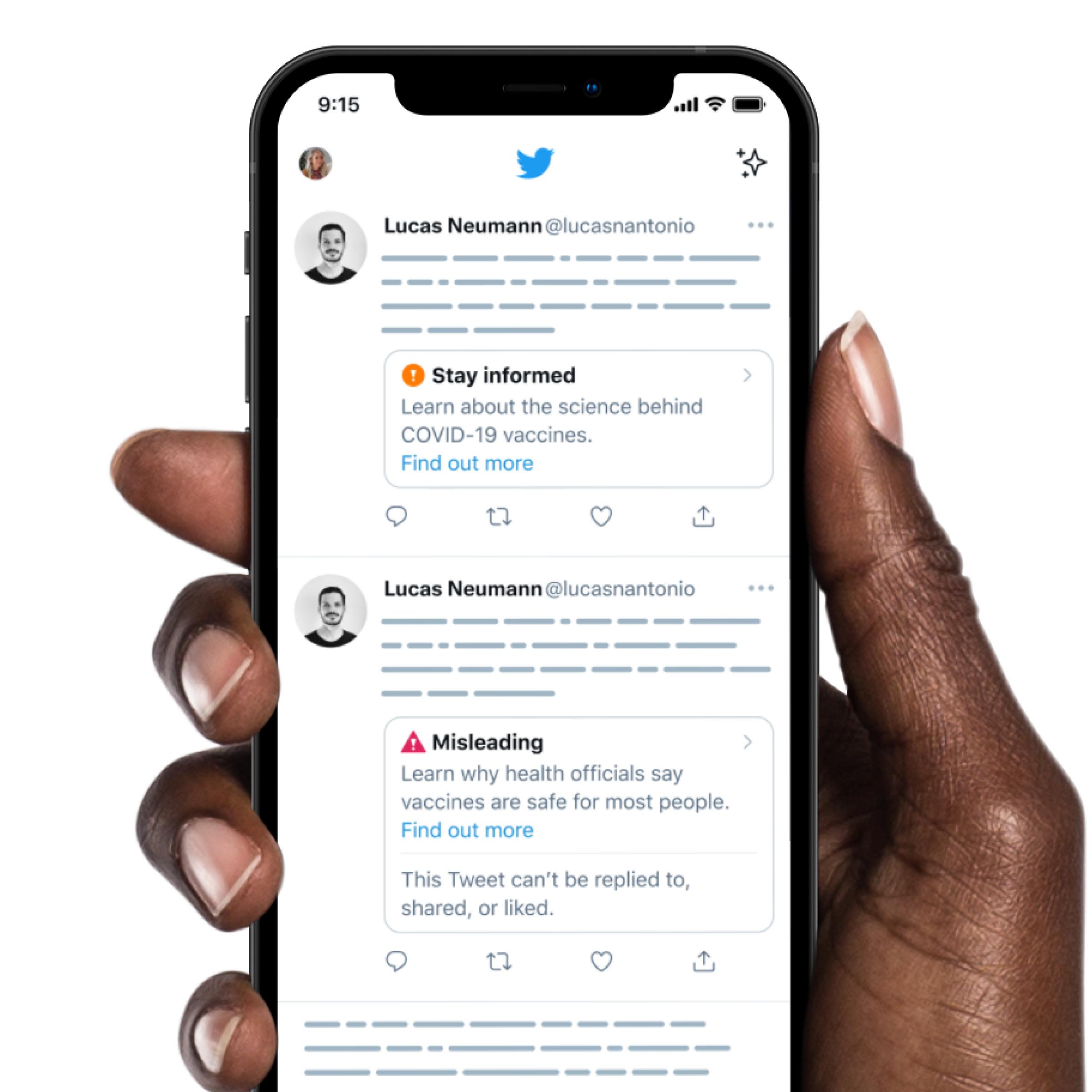
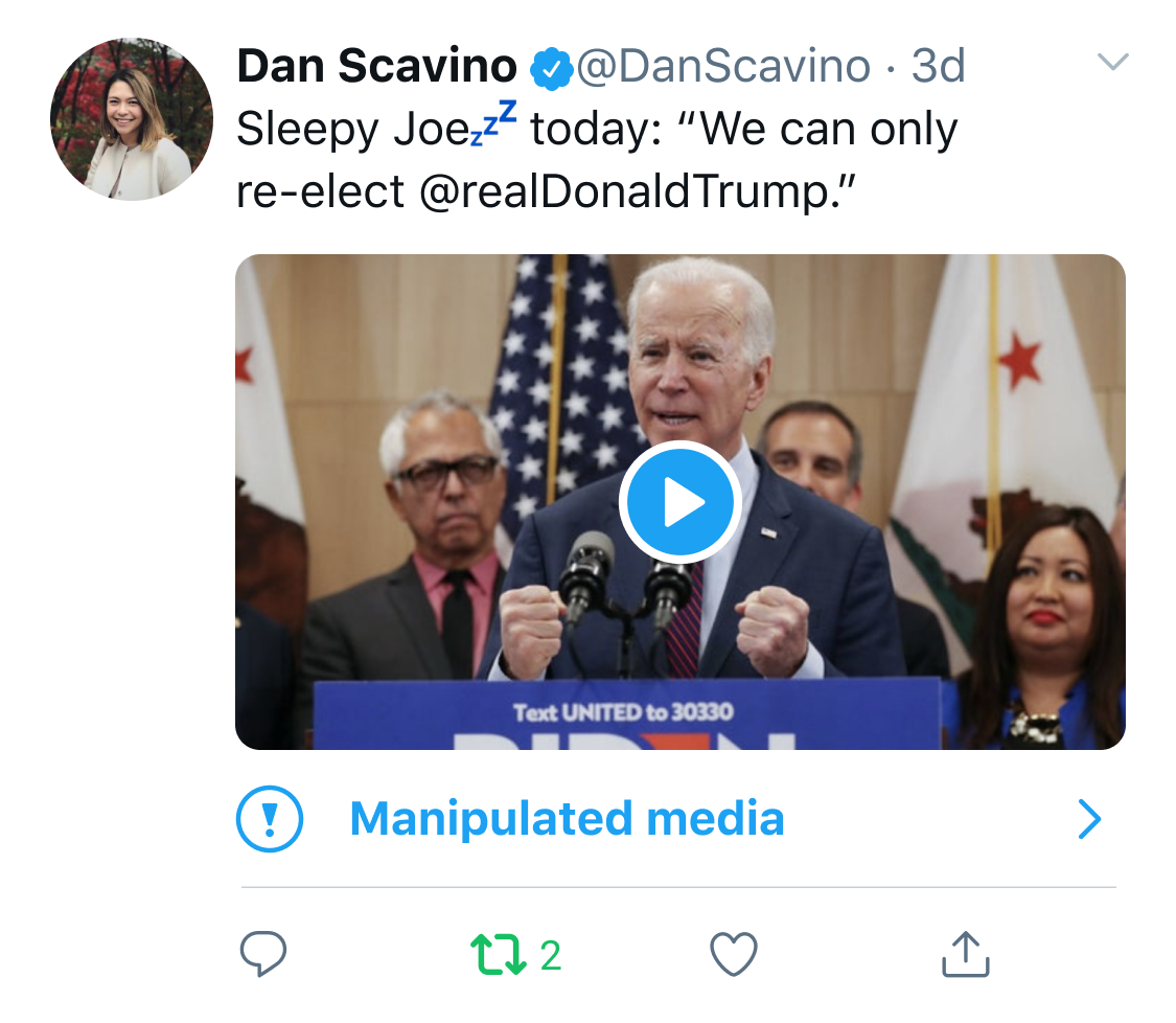
In serving the public conversation, Twitter's goal is to make it easy to find credible information from authoritative sources on Twitter and to limit the spread of potentially harmful and misleading content. In 2020, before I joined, Twitter created a visible annotation on Tweets known to contain misleading information. This is how the labels looked initially:
Labels provide a way for Twitter to move beyond the binary of leaving harmful content up or taking down and address potentially misleading information in a way proportionate to the severity of harm it poses. When I joined the team, I was tasked with helping improve the design of the labeling system to reach that goal.
The original design had key problems we were trying to solve:
Even though the labels look like a small surface on the product, the complexity behind getting them just right is surprising. This redesign was a huge cross-functional effort, with many key players across design, content strategy, policy, product, and engineering.
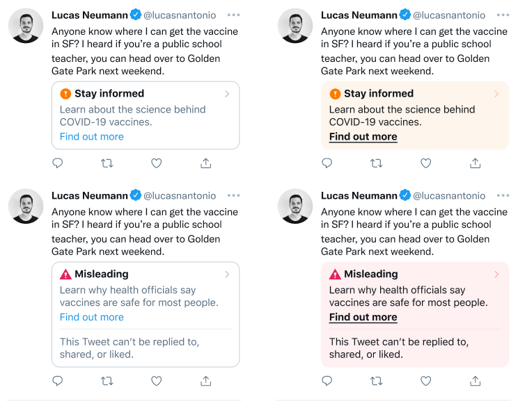
We explored a spectrum of designs (that, unfortunately, I can't share here!), and evaluated each of them in about a dozen rounds of critique and iteration.
We took some of the designs to qualitative research and got positive feedback on the following designs. Users felt that these were more clear, transparent, and helpful than the original.
We ran an AB test in production, for millions of customers, with control, A and B variants. Here's the official Tweet announcing the experiment:
Last year, we started using labels to let you know when a Tweet may include misleading information.
— Twitter Support (@TwitterSupport) July 1, 2021
For some of you on web, we’ll be testing a new label design with more context to help you better understand why a Tweet may be misleading. https://t.co/p1KONJz5Vo pic.twitter.com/m55f4RlMDg
After a few months of running the experiment, we found that the A/B test was a success:
With the new confidence in the labels, we decided to roll out the new labels to all users on the platform. Here's the announcement Tweet:
Redesigned labels for potentially misleading Tweets are now rolling out to more of you.
— Twitter Support (@TwitterSupport) November 16, 2021
In our test, more people clicked into the new labels and fewer people Retweeted or liked potentially misleading Tweets with these labels. We'll continue to improve our label design. https://t.co/MKYKtHJOFA pic.twitter.com/LimMdwbtuF
Even though this redesign is more successful than the original one, there is still room to improve: one common feedback is that the new component we designed is too similar to Quote Tweets and other Tweet attachments, and could be hard for users to tell them apart. We're already planning up a new round of iteration for 2022, and I'll update this post as soon as the results come out.
This website was built using Obsidian, Eleventy and Vercel.
The text is set in Untitled by Klim Type Co.