27 Apr 20
Petal Card Inc.
Everyday quick-wins
Intro
During my time at Petal, I tried to document design experiments like these and their results. This is a collection of tactical, small design wins, a sort of journal. Looking for a robust case study? Try here.
 |
 |
| Before |
After ✓ |
| Customer support and usability testing revealed that users had trouble filtering important content that was two clicks away. |
By exposing the filter labels, users don't need to guess what's inside the dropdown. Engagement increased ~500%. |
 |
 |
| Before |
After ✓ |
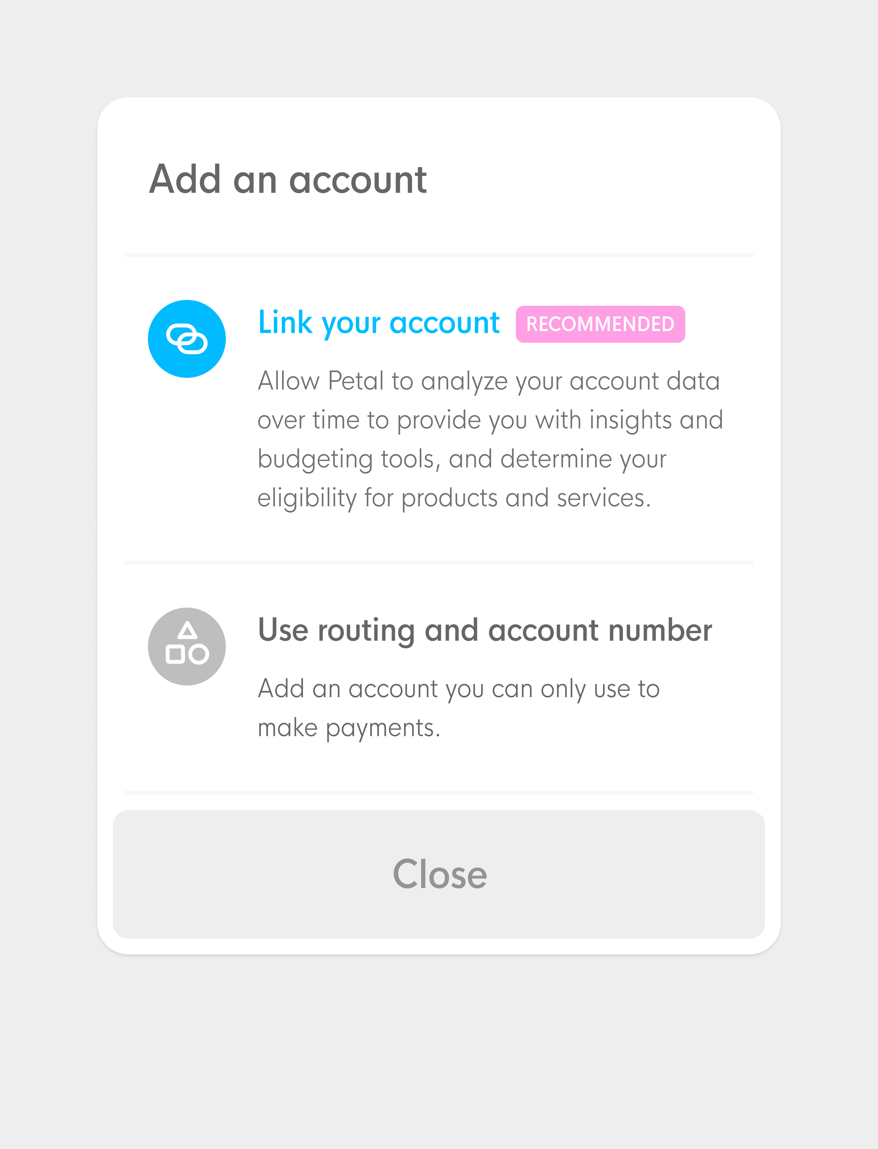
| Highest point of friction for Petal users is linking their accounts. |
By AB testing many hypothesis, we achieved a version that converts 117% more than the initial design. |
 |
 |
| Before |
After ✓ |
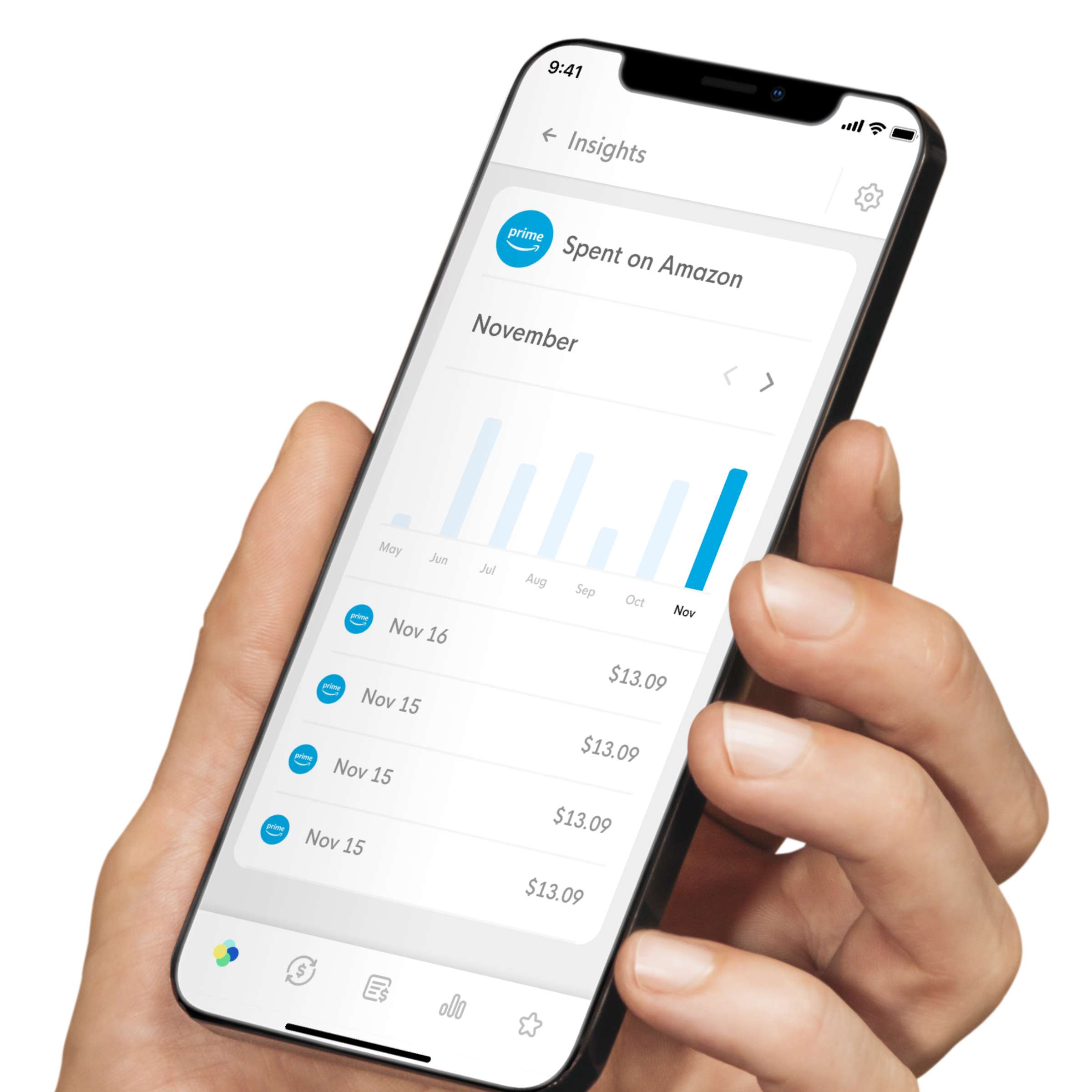
| Merchants were named with the raw strings we received, and category icons were assigned. |
With some quick Regex, we're able to clean up names and display curated logos for +50% of purchases. |
 |
 |
| Before |
After ✓ |
| Our desktop app was left aside for a while, missing some important navigation and styling alignments with the mobile app |
Unified design allowed more consistent, accessible experience, shared components and simpler code. |
 |
 |
| Before |
After ✓ |
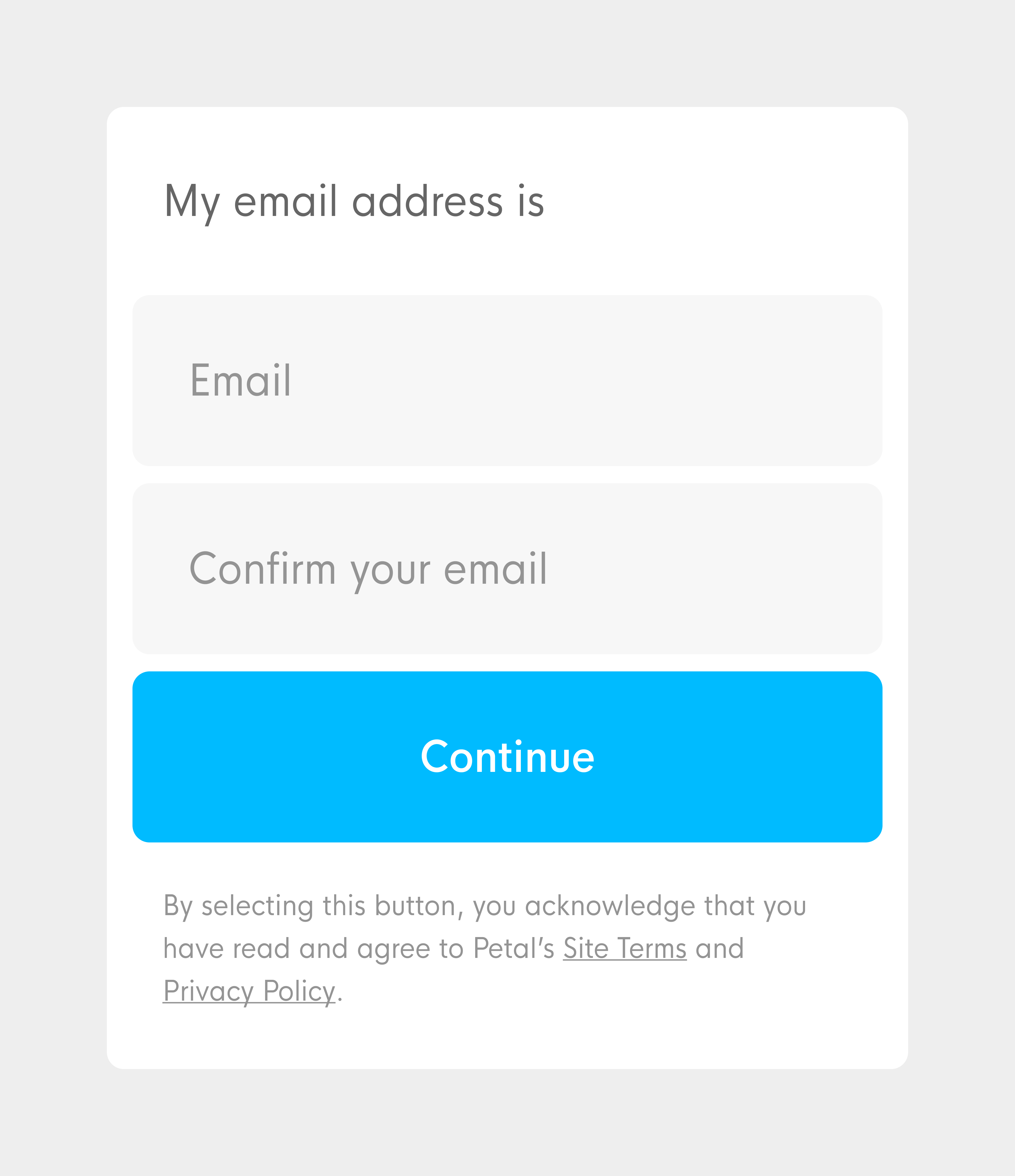
| Initial modals had CTA and dismiss actions too close to each other and taking too much space. Centered rendering also becomes a problem as out phones grow taller and taller. |
Better distributed buttons allows for extra actions such as navigation and secondary CTAs and are more ergonomic on tall devices. |
 |
 |
| Before |
After ✓ |
| Quite a few of Petal's initial designs didn't meet color contrast guidelines. |
It's a daily battle towards better legibility! |
 |
 |
| Before |
After ✓ |
| Initially, thin, light-gray fonts were "in fashion" and useful to get Petal "hyped" for its "designer look". |
We replaced low-contrast text even from legal disclaimers. Switching from light to regular font weight also goes a long way for legibility. |
 |
 |
| Before |
After ✓ |
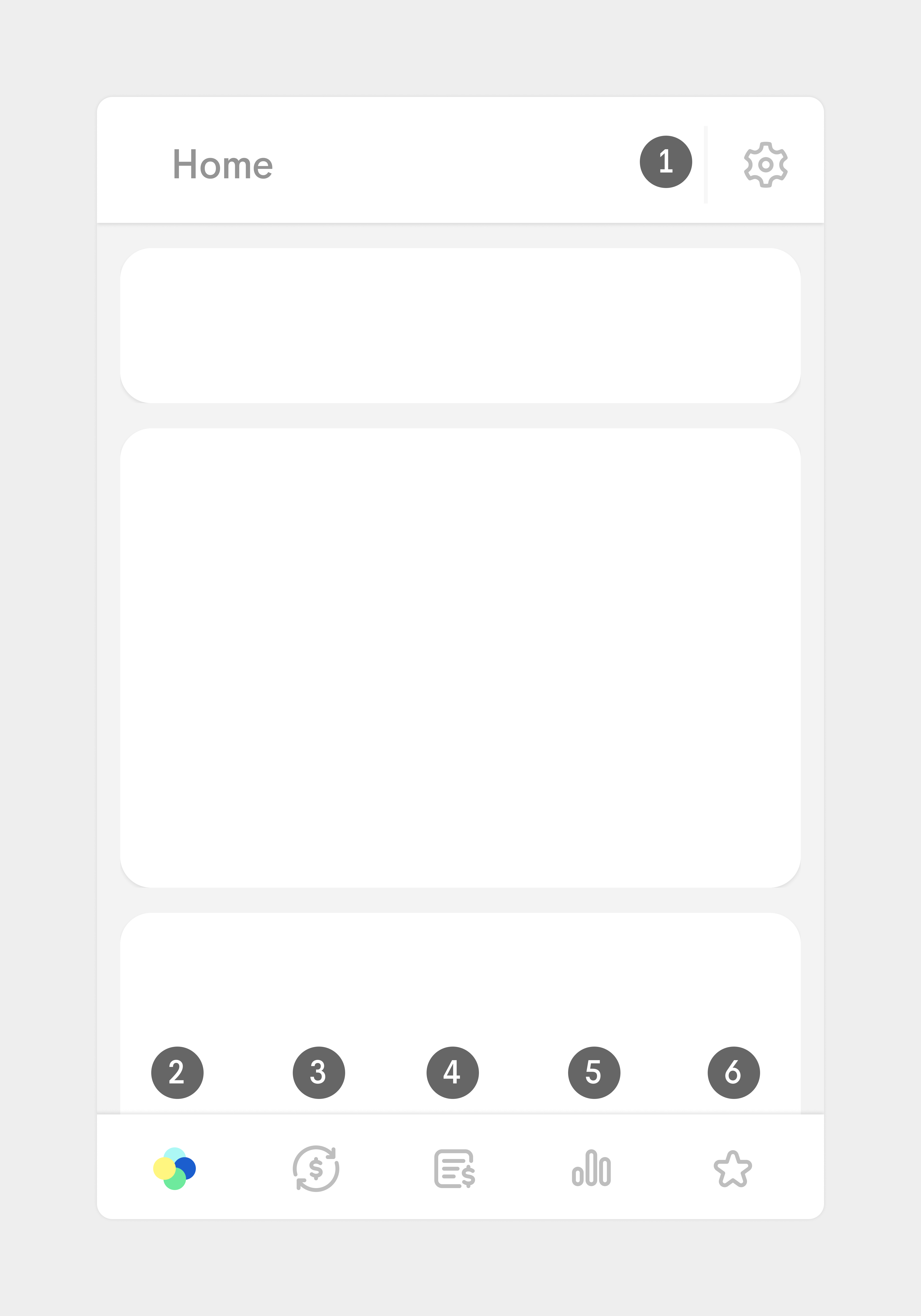
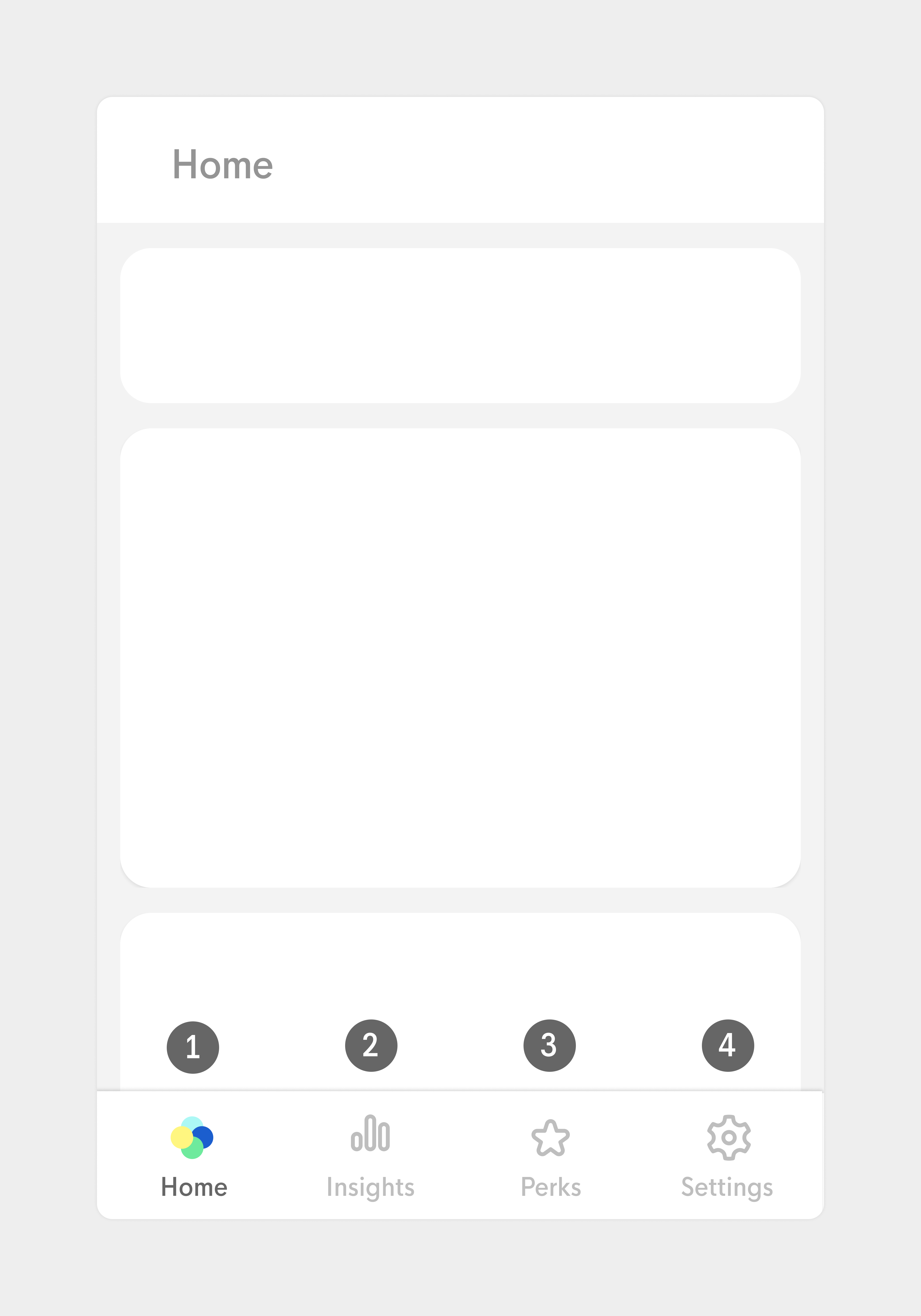
| As our app grew, our minimalist navigation starter to get too cryptic. Users relied on trial and error to find the desired content. |
Some Information Architecture gymnastics will soon enable us to achieve a much more understandable "home" for your money. |
 |
 |
| Before |
After ✓ |
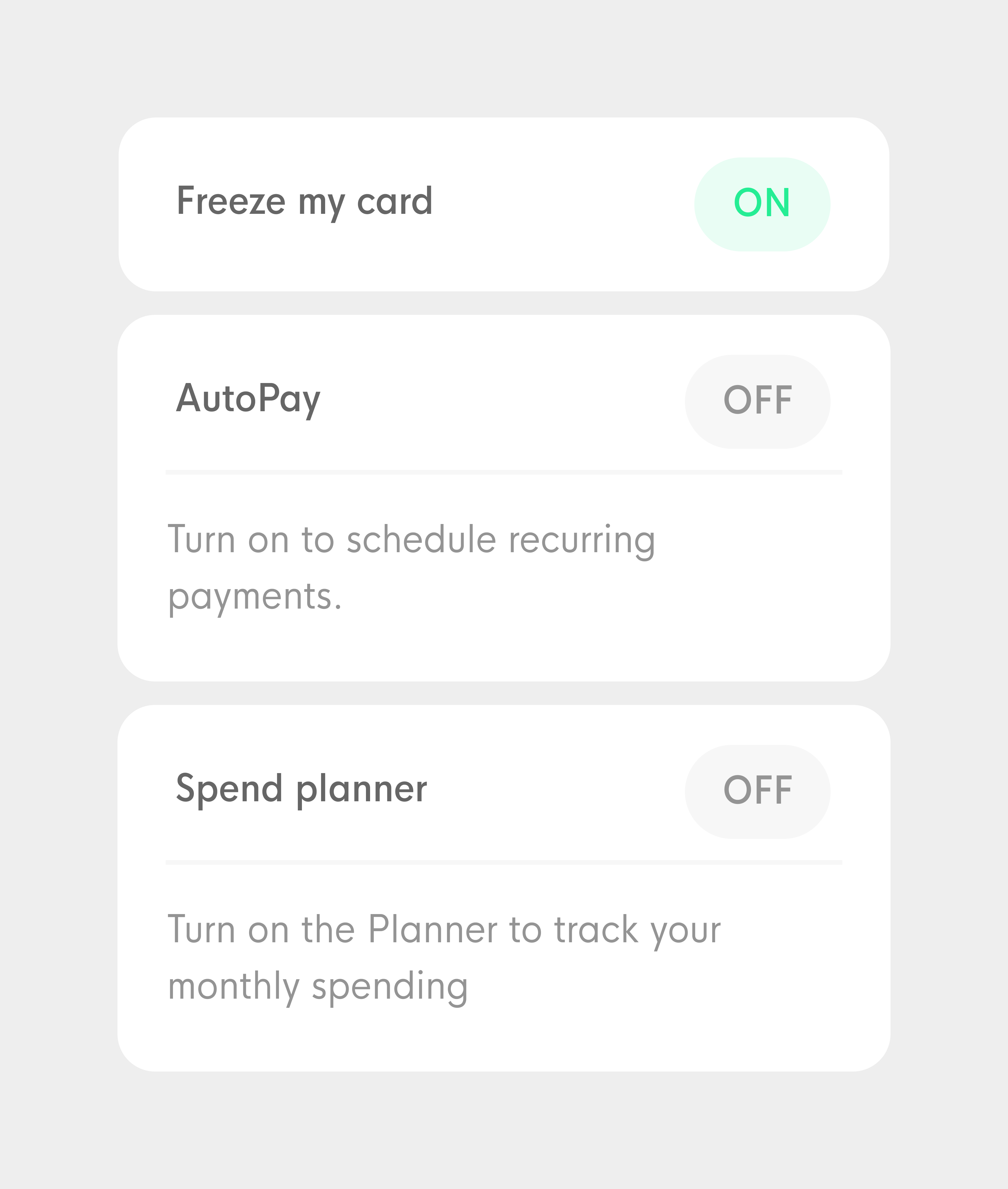
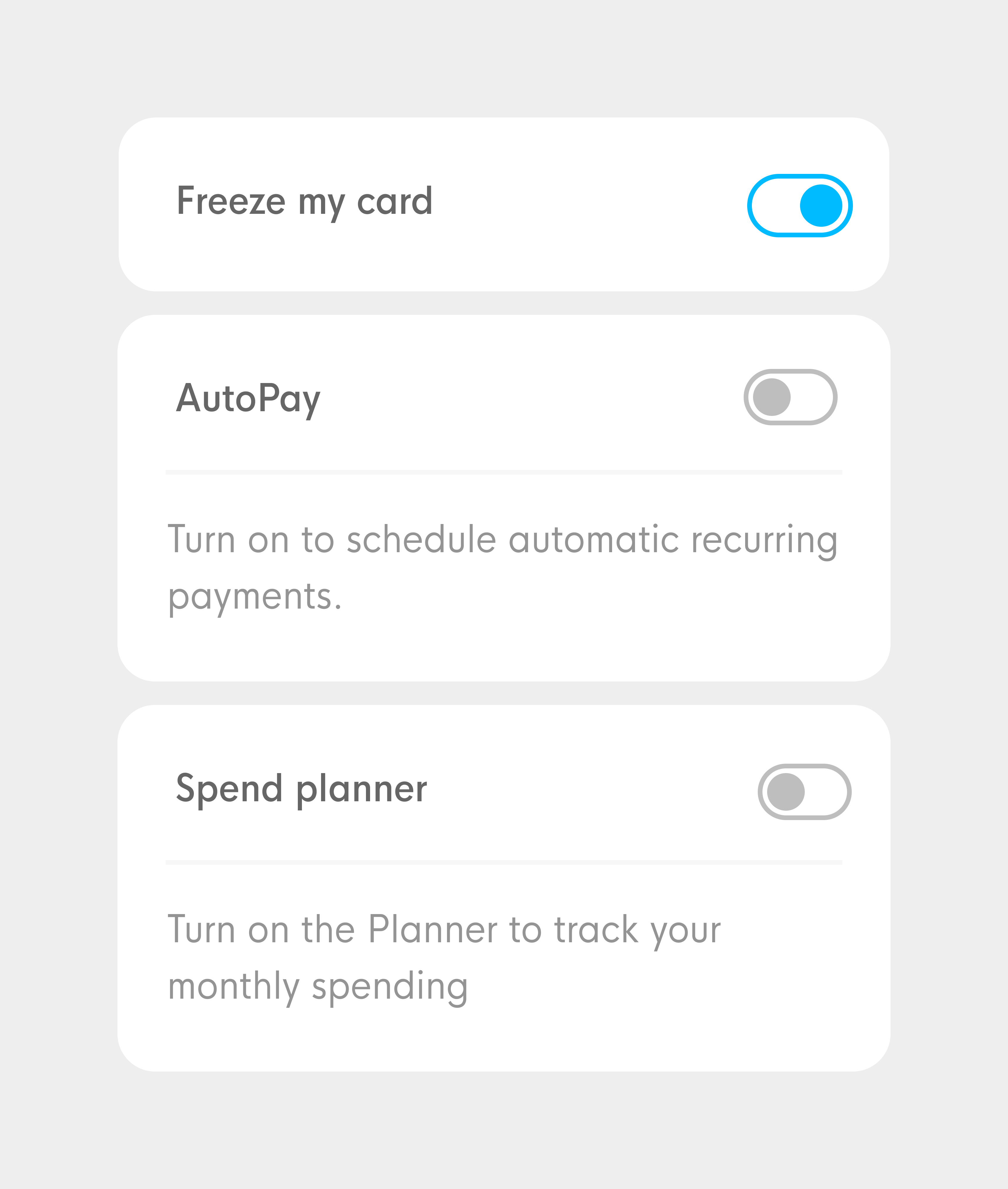
| Our custom on/off indicators had low contrast and weren't considered "clickable" by users |
Using a more common pattern proved successful for user understanding. |
 |
 |
| Before |
After ✓ |
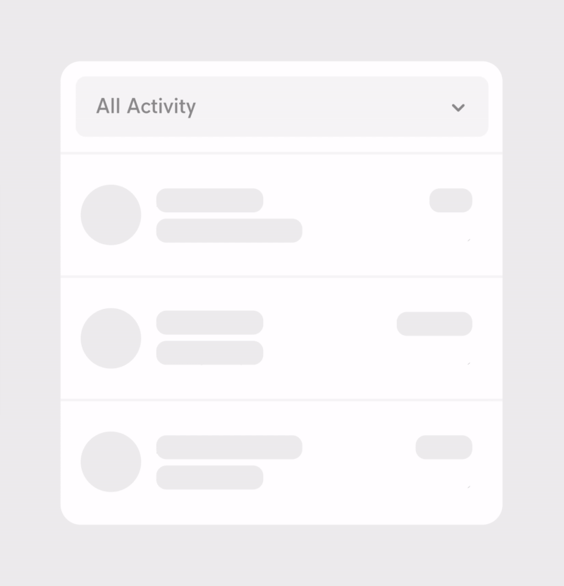
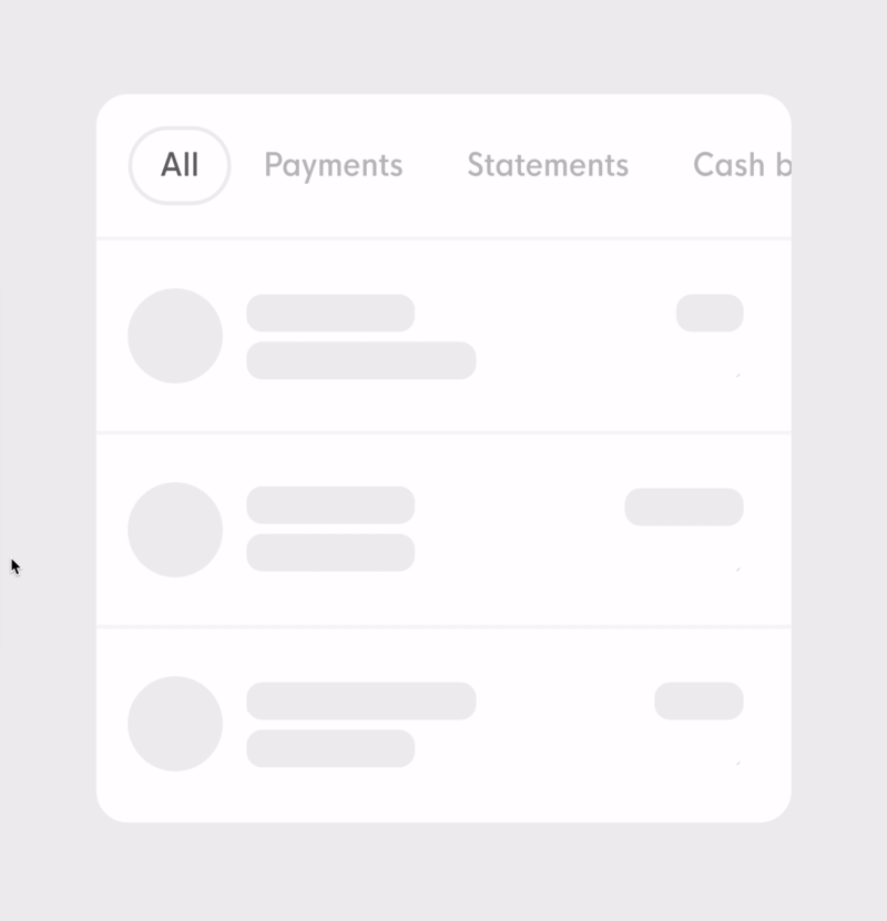
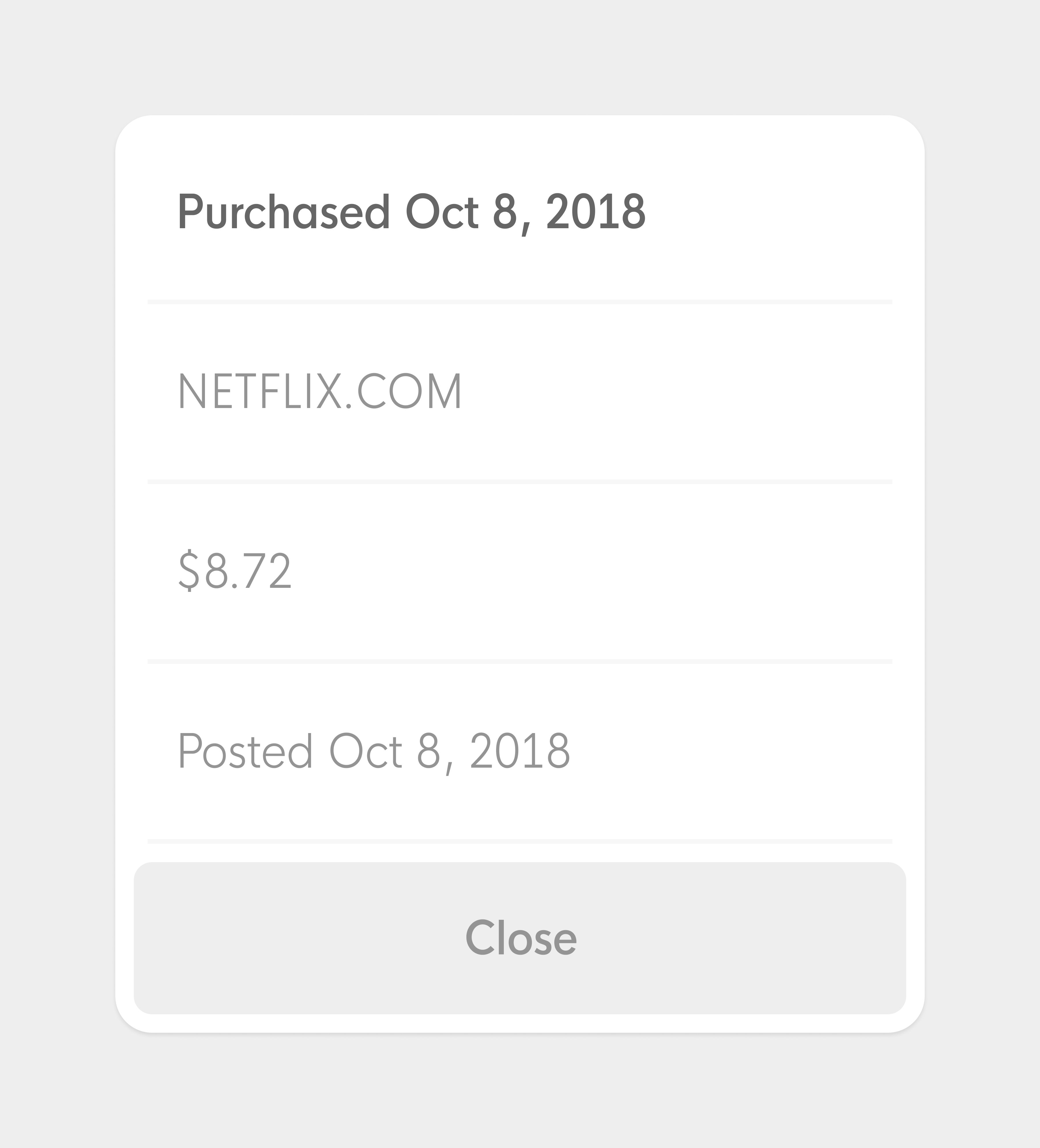
| Our first iteration was a simple table with the raw data we got from the backend |
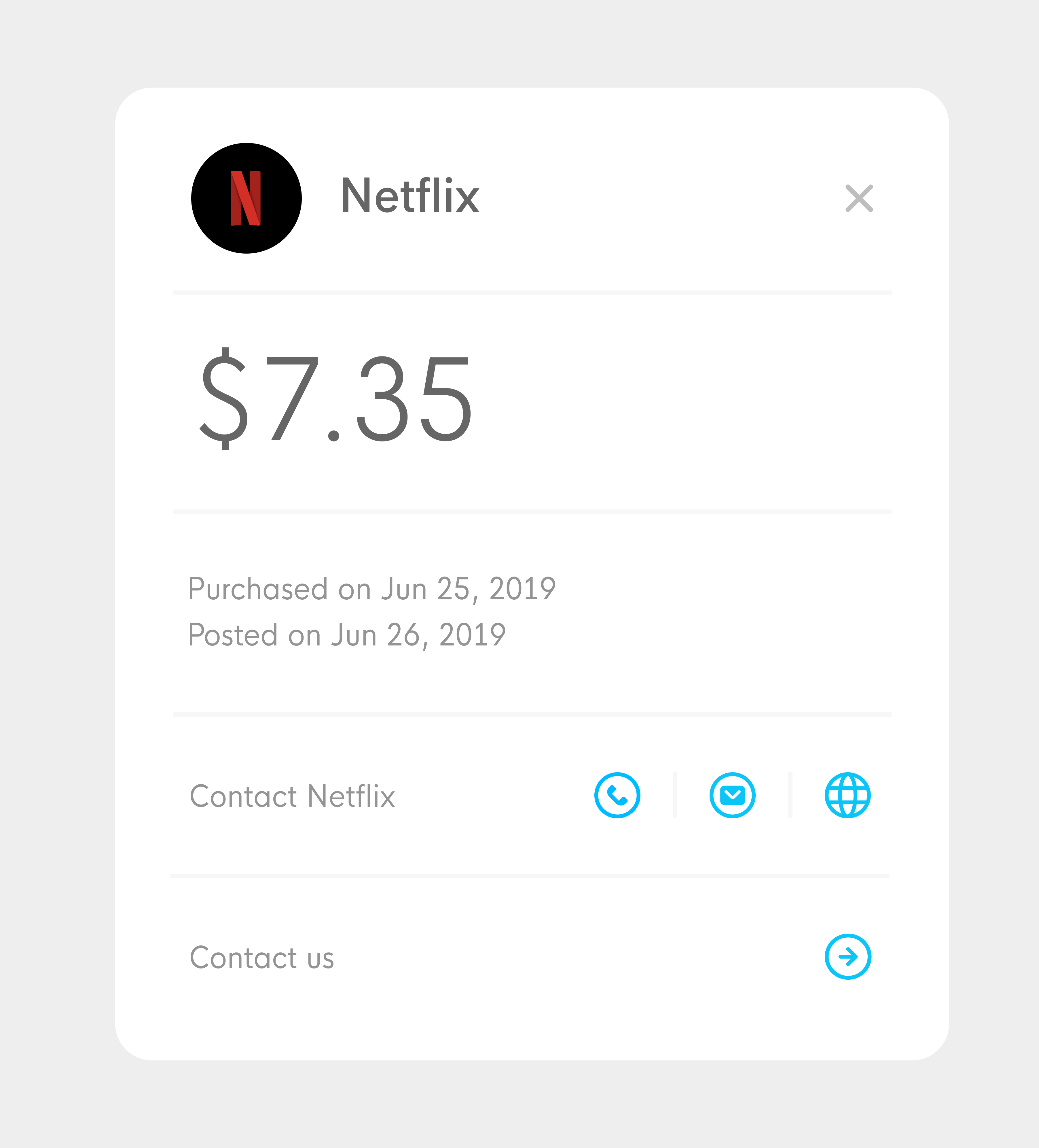
With time, we added clean brand names, logos, contact and dispute buttons. |