Case studies
Building Community Notes
Building Nubank
Petal quick wins
Personal
About me
My notebook
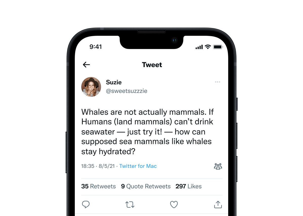
People who signed up to rate and write Community Notes need a way to know that a Tweet has received proposed notes that still needs more ratings.
Initially, during the early stages of Community Notes as an experimental feature, we aimed for a design that would be minimally intrusive. Our initial approach included a small icon placed in the bottom right corner of the Tweet:
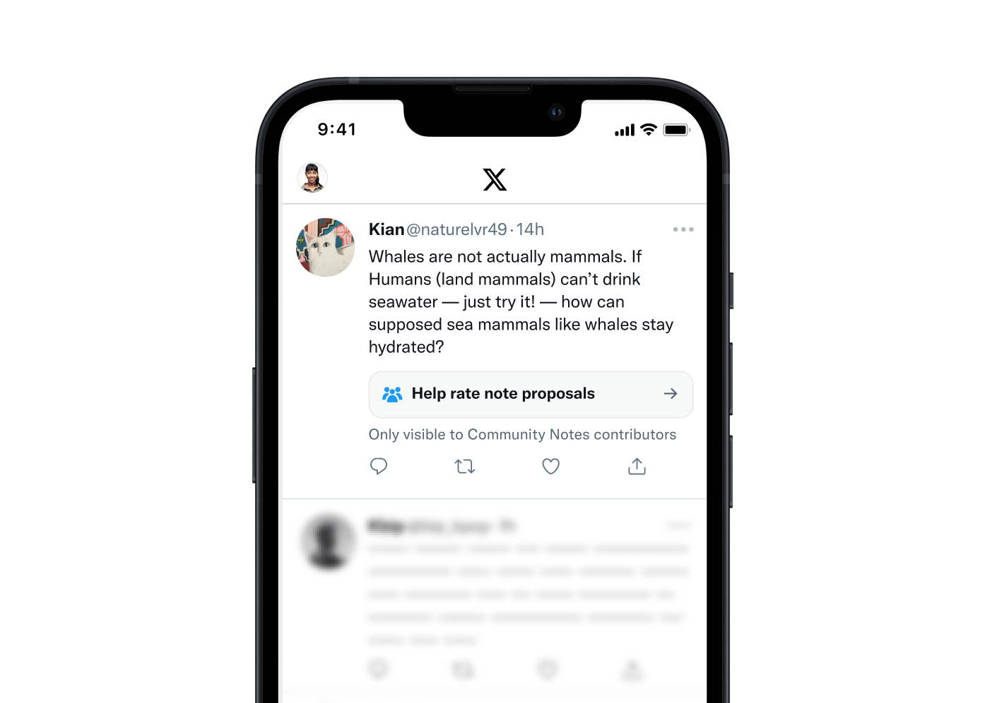
This icon worked well during the pilot phase of the program, allowing us to make adjustments without impacting Twitter's primary interfaces. However, as the program expanded, it became evident that the icon was not prominent enough to generate the necessary rating activity. We recognized the need for a more noticeable method for contributors to identify Tweets with notes requiring additional ratings directly in their home timeline.Our solution was to introduce a small banner that spanned the Tweet card, with a short call to action.
Overtime, as the volume of notes grew, and the task of reviewing them more repetitive, the extra tap on this banner to see and evaluate the actual content of the note became a burden. We needed a new design that would:
We experimented with various options:
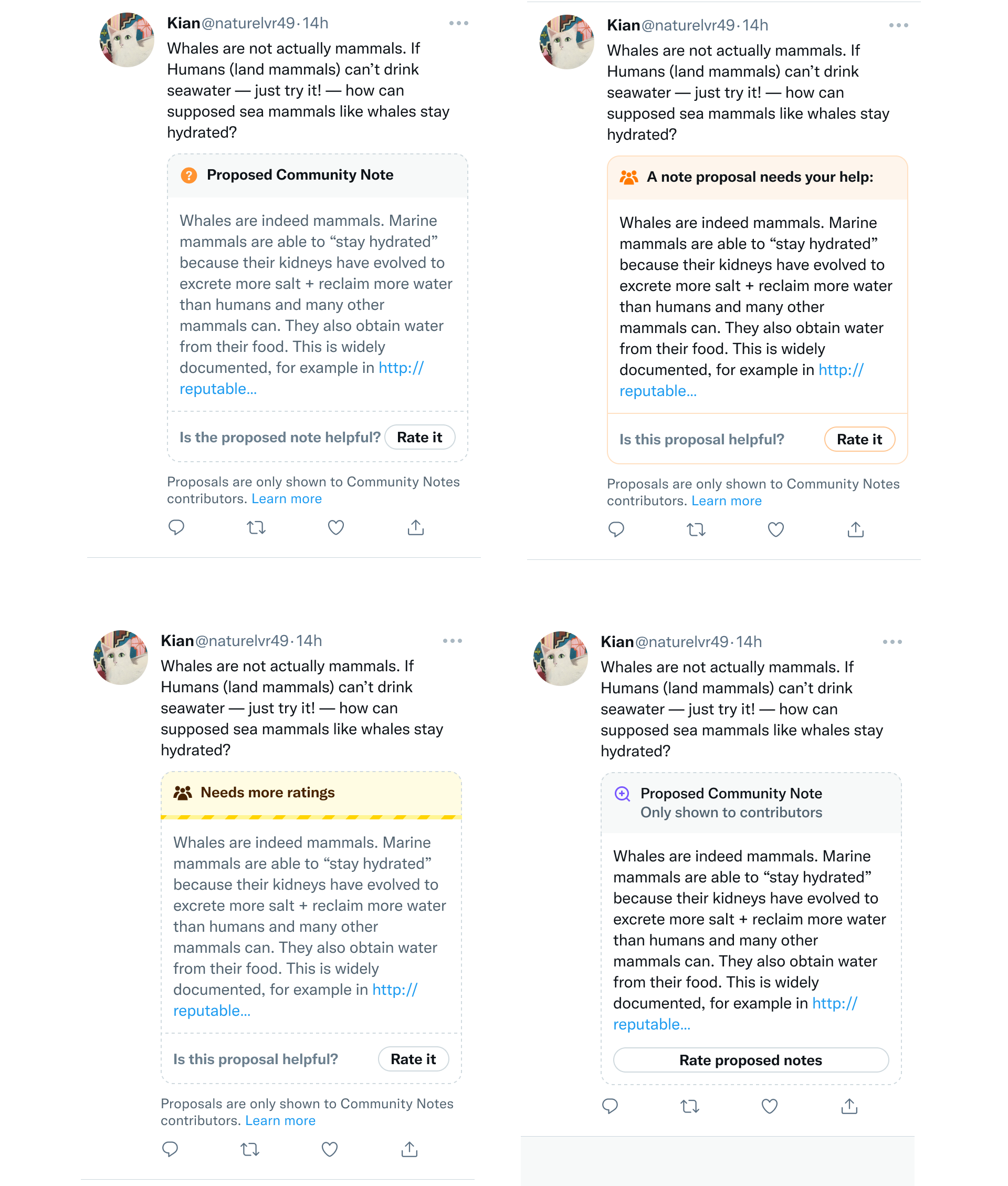
And landed on a design that uses dashed outline to communicate that the note is tentative. We also adjusted the color scheme to gray, denoting an "inactive" note, as opposed to the primary colors used for "active" notes viewable by all:
We implemented this solution and announced it here:
To help contributors find and rate proposed notes faster, we’re experimenting with previewing some of them directly on posts, instead of behind a tap. As always, proposals are shown to contributors only, until they reach a “Helpful” status. Live today on the web; mobile coming… pic.twitter.com/SW65SZI3RZ
— Community Notes (@CommunityNotes) September 22, 2023
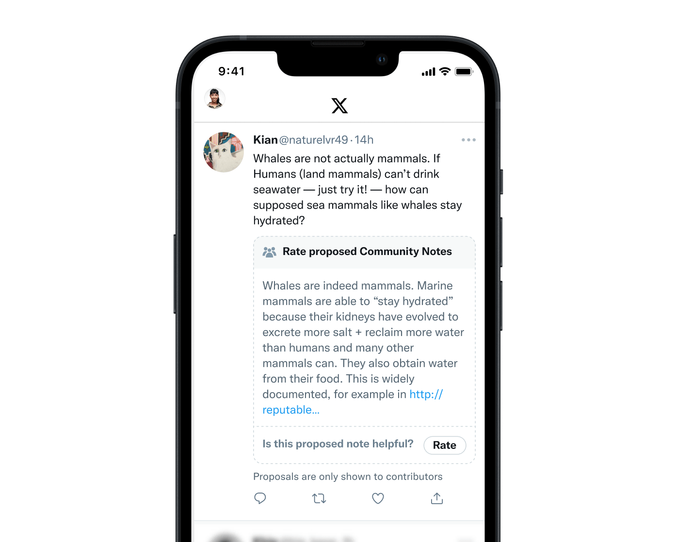
However, following the launch, we discovered a key issue with this design. Many screenshots of proposed notes began circulating on the platform, and since the disclaimer stating that the note is "only visible to contributors" was located at the bottom, it was often cropped out. This led to misunderstandings, with many people perceiving the notes as "live" and accessible to everyone.
Taking this feedback into account, we made further iterations and decided that the most unambiguous way to convey that the note is tentative and not yet live was to move the disclaimer to the top of the note, making it more prominent:
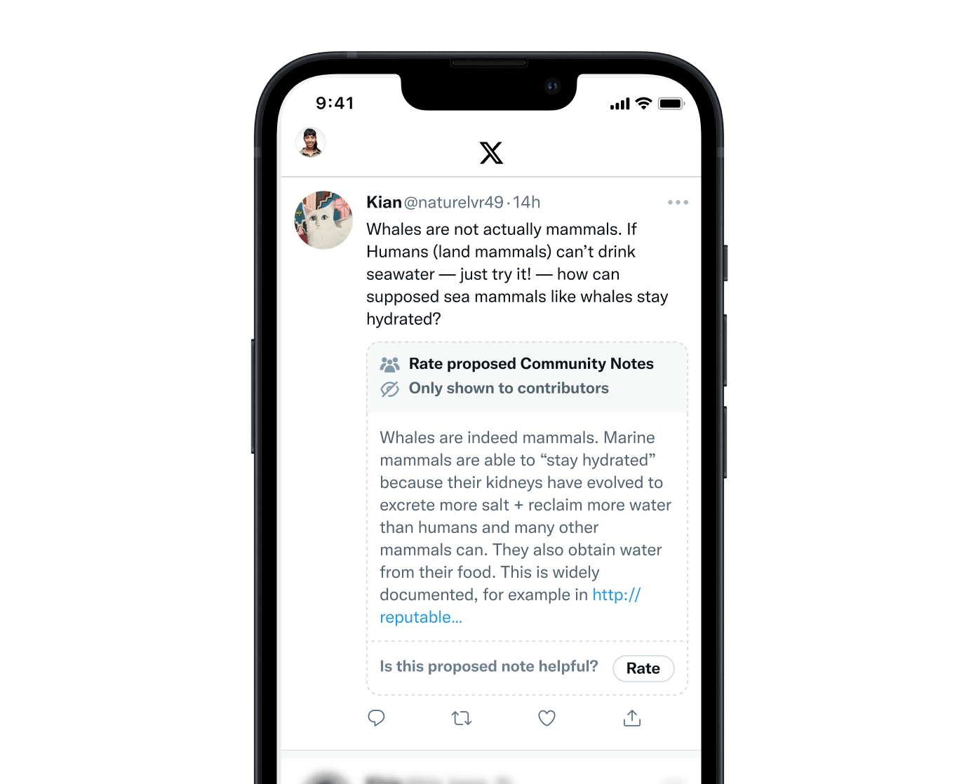
With this change, we hope that contributors will be able to spot and evaluate proposed notes much faster, while making it extremely clear to non-contributors who see screenshots of these notes that they are not yet live.
This website was built using Obsidian, Eleventy and Vercel.
The text is set in Untitled by Klim Type Co.